Materializer WP
A set of Material Design components for WordPress
Materializer WP is a fully-featured set of Material Design components, packed up in a WordPress plugin, and ready to be used on any website.
The plugin is ‘short-code based’, so you can use all of the features easily on any post, page, or custom post type. There over 25 different short-codes and components that take care of all the hard work, and allow you to turn any blog or website into a Material Design wonderland.
Getting Started
Installation
To install the plugin:
- Download the `.zip` file.
- In your Wordpress Dashboard, navigate to “Plugins -> Add New”
- Select “Upload Plugin”, and choose this plugins zip file from your computer. Hit “Install Now”.
- Once installed, simply press “Activate Plugin”, and you’re ready to go!
Quick Start
As a quick example of what’s possible, here is how you would set up a Material Design Card:
  [card title="A Cool Card!" text="text-darken-3 grey" title_color="blue"]
  I am a very simple card. I am good at containing mall bits of
  information. I am convenient because I require little markup to use
  effectively.
  [link text="blue" to="/"]Go Home[/link]
  [/card]
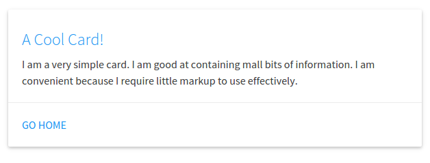
In this example, we have a [card][/card] shortcode, with a few
attributes. A title, the text color, and the title color. Inside of the
shortcode we have a couple more things: The card’s text, and action
links (which also have a text color attribute, and a to attribute
which links to the home page).
And a Material Design card is as easy as that. Cards are a great way to have useful information and actions pop out at your visitor, while keeping a slick design.
Features
Shortcodes
There are over 25 different shortcodes and components to choose from. All of the shortcodes contain “attributes” that allow several different ways to build one component.
Below is a list of all the currently available components, click on one to view an example, and see how to customize it.
Cards
- Basic Card
- Image Card
- Revealing Card
Buttons
- Raised Button
- Floating Button
- Fixed Action Button
- Flat Button
- Large Button
Collapsibles
Collections
- Collection
- Link Collection
Dropdowns
Images
- Material Box Image
- Responsive Image
- Circular Image
Pagination
Loading Icons
- Linear Loader
- Fixed Linear Loader
- Circular Loader
- Flashing Circular Loader
Tables
- Striped Table
- Hoverable Table
- Centered Table
- Bordered Table
- Responsive Table
Viedos
- Responsive Video
- HTML5 Video
Color Pallette
There is a built in Material Design Color pallette that be used with every short-code. You’re not stuck with the default color scheme, so you can integrate Materializer into your existing website seamlessly.
…more info coming soon!
Shortcode Details
Cards
Basic Card
Available Attributes:
- title: The title of the card (optional)
- title~color~: The color of the title (optional)
- color: The backgrund color of the card (optional)
- text: The text color of the card (optional)
- Links: Nested Action Link short-codes (optional)
Example:
  [card title="A Cool Card!" text="text-darken-3 grey" title_color="blue"]
  I am a very simple card. I am good at containing mall bits of
  information. I am convenient because I require little markup to use
  effectively.
  [link text="blue" to="/"]Home[/link]
  [/card]
A Basic Card can also be refitted to be a more simple Card Panel:
Example:
[card color="teal" text="white"]
This is a simple panel card, these are really great for just
blocking together small bits of markup on a nice eye-catching
color
[/card]
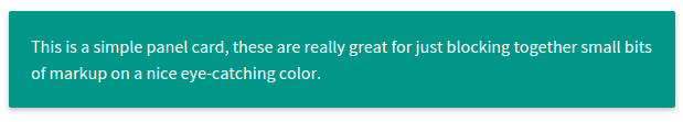
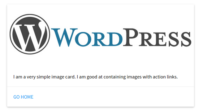
Image Card
Available Attributes:
- img: The link to an image for display on the card
- color: The background color of the card (optional)
- text: The text color of the card (optional)
- Links: Nested Action Link short-codes (optional)
  [card_img img="/wordpress-logo.png"]
  I am a very simple image card. I am good at containing images with
  action links.
  [link text="blue" to="/"]Home[/link]
  [/card_img]
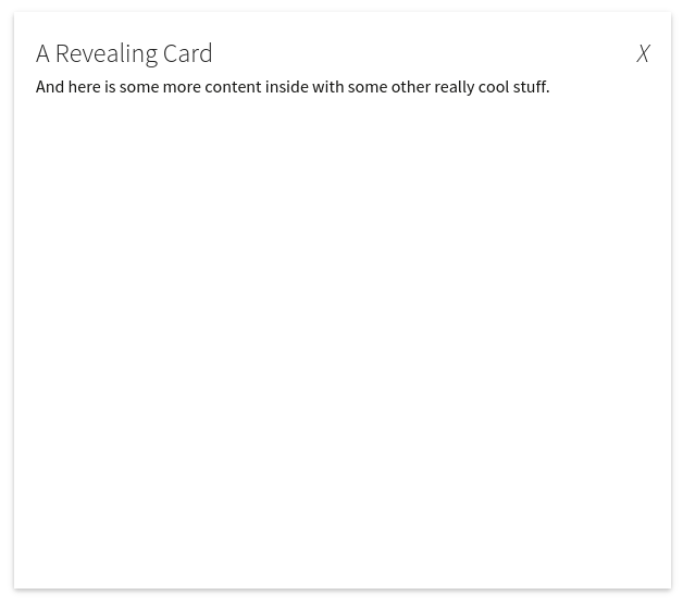
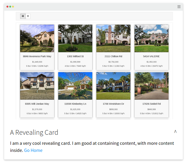
Revelealing Card
A Revealing Card is like a Basic Card that can be opened to display more information.
Available Attributes:
- title: The title of the card (optional)
- title~color~: The color of the title (optional)
- color: The backgrund color of the card (optional)
- text: The text color of the card (optional)
- img: The link to an image for display on the card
- links: Nested Action Link short-codes (optional)
Example:
[card_revealtitle="A Revealing Card"]
I am a very cool revealing card. I am good at containing content, with
more content inside.
[link text="blue" to="/"]Go Home[/link]
[card_open]And here is some more content inside with some other really cool stuff.[/card_open]
[/card_reveal]
Buttons
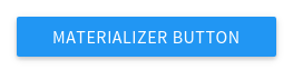
Raised Button
Available Attributes:
- to: The page to go to when the button is clicked
- color: The background color of the card (optional)
- text: The text color of the card (optional)
Example:
[btn to="/" color="blue" text="white"]Materializer Button[/btn]
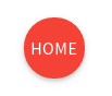
Floating Button
Available Attributes:
- to: The page to go to when the button is clicked
- color: The background color of the card (optional)
- text: The text color of the card (optional)
Example:
[btn_floating to="/" color="red" text="white"]Home[/btn_floating]
Fixed Action Button
Available Attributes:
- color: The background color of the card (optional)
- text: The text color of the card (optional)
- action: Nested
[action]shortcodes, that are the small popups when the button is hovered, they take all the attributes, plus the “to” attribute which is a link to a page.
Example:
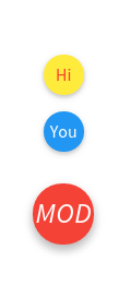
[btn_fixed_action color="red" text="white"]Home
[action to="/contact-us" color="yellow" text="red"]Hi[/action]
[action to="/" color="blue" text="white"]You[/action]
[/btn_fixed_action]
Flat Button
Available Attributes:
- to: The page to go to when the button is clicked
- color: The background color of the card (optional)
- text: The text color of the card (optional)
Example:
[btn_flat to="/"]Home[/btn_floating]

Large Button
Available Attributes:
- to: The page to go to when the button is clicked
- color: The background color of the card (optional)
- text: The text color of the card (optional)
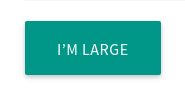
Example:
[btn_large to="/"]Home[/btn_floating]
Collapsibles
Collapsible
Available Attributes:
- type: Either popout or nothing.
- style: Either accordion, expandable, or nothing.
- color: The backgrund color of the card (optional)
- text: The text color of the card (optional)
- collapsible~item~: Nested
[collapsible_item]shortcodes, that make up each item in the component. They take a title, color, and text attribute.
Example:
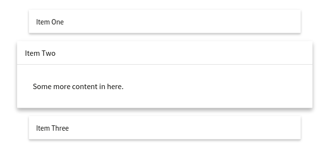
[collapsible]
[collapsible_item title="Item One"]Some content in here.[/collapsible_item]
[collapsible_item title="Item Two"]Some more content in here.[/collapsible_item]
[collapsible_item title="Item Three"]And some more content in this guy.[/collapsible_item]
[/collapsible]
Collections
Collection
Available Attributes:
- color: The backgrund color of the card (optional)
- text: The text color of the card (optional)
- collection~item~: Nested
[collection_item]shortcodes, that make up each item in the component. They take a color and text color attribute.
Example:
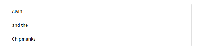
[collection]
[collection_item]Alvin[/collection_item]
[collection_item]and the[/collection_item]
[collection_item]Chipmunks[/collection_item]
[/collection]
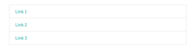
Link Collection
Available Attributes:
- type: Needs to be set to type=“links”
- color: The backgrund color of the card (optional)
- text: The text color of the card (optional)
- collection~item~: Nested
[collection_item]shortcodes, that make up each item in the component. They take a color and text color attribute - as well as a “to” attribute which is a page link.
Example:
[collection type="links"]
[collection_item]Alvin[/collection_item]
[collection_item]and the[/collection_item]
[collection_item]Chipmunks[/collection_item]
[/collection]
Dropdowns
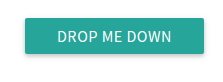
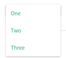
Dropdown
Available Attributes:
- name: Give the dropdown component a name (required)
- color: The backgrund color of the card (optional)
- text: The text color of the card (optional)
- dropdown~item~: Nested
[dropdown_item]shortcodes, that make up each item in the component. They take a color and text color attribute - as well as a “to” attribute which is a page to link to.
Example:
[[dropdown name="mydrop" text="white"]
Drop Me Down
[dropdown_item to="/"]Home[/dropdown_item]
[dropdown_item to="/services/"]Services[/dropdown_item]
[dropdown_item to="/contact"]Contact Us[/dropdown_item]
[/dropdown]]
Images
Material Box Image
The Materializer Image Box displays a normal image, and when it clicked, it open the image in a fullscreen “lightbox” style display.
Available Attributes:
- src: The link to the image
Example:
[img_box src="http://mysite.com/image.jpg"]
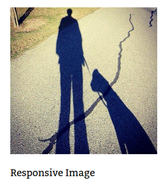
Responsive Image
Automatically makes images responsive
Available Attributes:
- src: The link to the image
Example:
[img_responsive src="http://mysite.com/image.jpg"]
Circular Image
Makes any image circular
Available Attributes:
- src: The link to the image
Example:
[img_circle src="http://mysite.com/image.jpg"]

Pagination
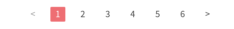
Pagination
Available Attributes:
- color: The backgrund color of the card (optional)
- text: The text color of the card (optional)
- Links: Nested Action Link short-codes (optional)
- items: [pag~item~]’s are what make up the pagination. In addition
to color and text, These can take a variety of attributes:
- disabled: unclickable
- active: make this pag~item~ active
- to: a link to a page
Example:
[pagination]
[pag_item disabled]<[/pag_item]
[pag_item to="#!" active]1[/pag_item]
[pag_item to="/page-2"]2[/pag_item]
[pag_item to="/page-3"]3[/pag_item]
[pag_item to="/page-4"]4[/pag_item]
[pag_item to="/page-5"]5[/pag_item]
[pag_item to="/page-6"]6[/pag_item]
[pag_item to="/pages"]>[/pag_item]
[/pagination]
Loading Icons
Linear Loader
Available Attributes:
- color: The backgrund color of the loader (optional)
- text: The progress color of the loader (optional)
Example:
[preloader_linear]

Fixed Linear Loader
Available Attributes:
- color: The backgrund color of the loader (optional)
- text: The progress color of the loader (optional)
- width: The width of the progress bar to fill
Example:
[preloader_linear width="75%"]

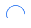
Circular Loader
Available Attributes:
- color: The color of the loader (optional)
Example:
[preloader_circular]
Flashing Circular Loader
Available Attributes:
- flashing: This needs to be inside the shortcode.
Example:
[preloader_circular flashing]

Tables
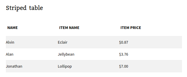
The table shortcodes are a bit different in that they only wrap existing HTML (or shortcodes).
You can use any of the table types (striped, hoverable, centered, responsive, bordered) together in the same shortcode.
Example:
[table style="striped"]
<thead>
 <tr>
   <th data-field="name">Item Name</th>
   <th data-field="price">Item Price</th>
 </tr>
</thead>
<tbody>
    <tr>
      <td>Eclair</td>
      <td>$0.87</td>
    </tr>
    <tr>
      <td>Jellybean</td>
      <td>$3.76</td>
    </tr>
    <tr>
      <td>Lollipop</td>
      <td>$7.00</td>
    </tr>
</tbody>
[/table]
Striped Table
Available Attributes:
- color: The backgrund color of the table (optional)
- text: The text color of the table (optional)
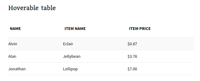
Hoverable Table
Available Attributes:
- color: The backgrund color of the table (optional)
- text: The text color of the table (optional)
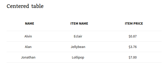
Centered Table
Available Attributes:
- color: The backgrund color of the table (optional)
- text: The text color of the table (optional)
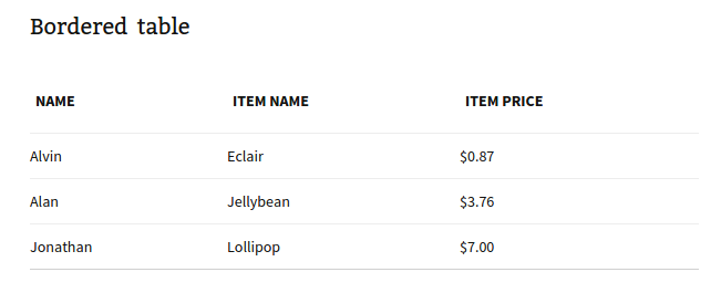
Bordered Table
Available Attributes:
- color: The backgrund color of the table (optional)
- text: The text color of the table (optional)
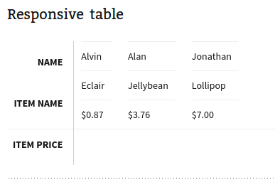
Responsive Table
Available Attributes:
- color: The backgrund color of the table (optional)
- text: The text color of the table (optional)
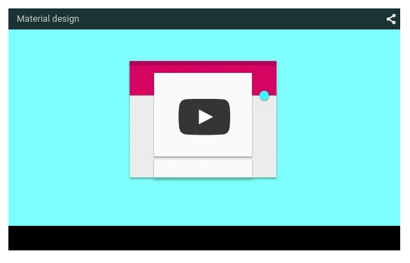
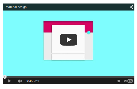
Videos
Responsive Video
Available Attributes:
- src: the link to the video
- width: the width of the video in px (optional)
- height: the height of the video in px (optional)
- allowfullscreen: Allow the video to be made fullscreen (no value, just set inside the shortcode)
- nocontrols: Remove play, pause, progress controls (no value, just set inside the shortcode)
- frameborder: Width of the border around the video (recommended 0, optional)
Example:
[video src="//www.youtube.com/embed/Q8TXgCzxEnw?rel=0" width="500px" width="100%" allowfullscreen]
HTML5 Video
Available Attributes:
- src: the link to the video
- width: the width of the video in px (optional)
- height: the height of the video in px (optional)
- allowfullscreen: Allow the video to be made fullscreen (no value, just set inside the shortcode)
- nocontrols: Remove play, pause, progress controls (no value, just set inside the shortcode)
- frameborder: Width of the border around the video (recommended 0, optional)
Example:
[video src="//www.youtube.com/embed/Q8TXgCzxEnw?rel=0" width="500px" width="100%" allowfullscreen]